> ## Documentation Index
> Fetch the complete documentation index at: https://docs.enso.build/llms.txt
> Use this file to discover all available pages before exploring further.
# Cross-chain Route Widget
> A React component and web app for cross-chain routing of DeFi positions and tokens.
export const date_0 = "2025-06-17"
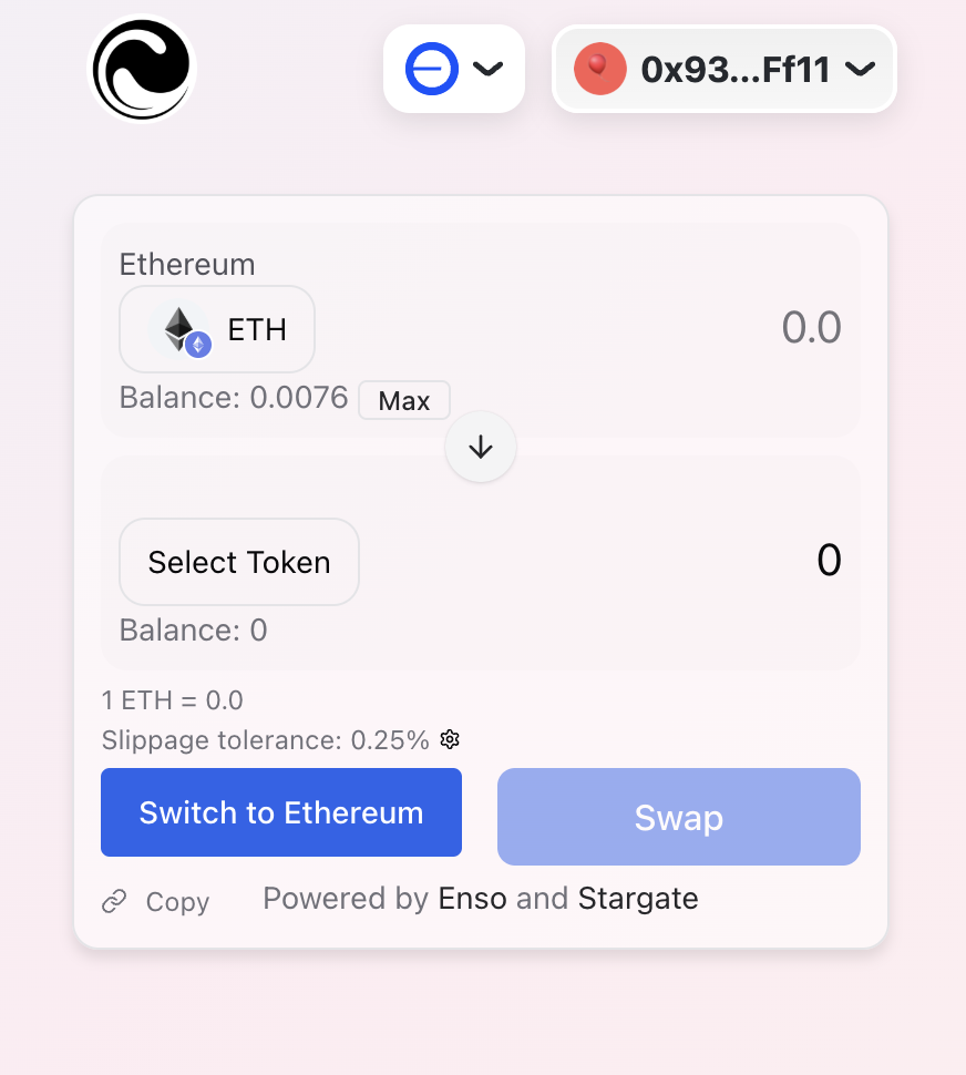
The Cross-chain Route Widget lets you add cross-chain token routing feature to your app. Under the hood, it uses the Enso API to find the best route, and bridge the tokens to the destination chain via Stargate.
Highly customizable, the widget allows you to configure various parameters, including:
* **Source and destination chains**: configure specific source and destination chains for the routing process.
* **input and output tokens**: allow free choice or restrict to specific tokens for specialized use cases.
* **The output project**: destination project for the output token for building protocol-specific flows.
Try it out!
Source code
Integrate cross-chain routing widget in your app
## How it Works
After selecting the input token on the source chain, and the output token on the destination chain, the widget will show the best route for the tokens before you sign and send the transaction.
 ## Integrate
Follow these steps to integrate the Cross-Chain Route Widget into your React application.
Install the package:
```bash theme={null}
npm install @ensofinance/shortcuts-widget
```
Import the component and use it in your app. To get your API key, visit the [Developer portal](https://developers.enso.build).
The widget must be used within a `WagmiConfig` provider.
```tsx theme={null}
import SwapWidget from '@ensofinance/shortcuts-widget';
function App() {
return
}
export default App;
```
```tsx theme={null}
import SwapWidget from '@ensofinance/shortcuts-widget';
function App() {
return
}
const darkThemeConfig = {
theme: {
tokens: {
spacing: {
1: "10px",
2: "20px",
},
},
semanticTokens: {
colors: {
// Background colors
bg: { value: "#0f172a" }, // Dark blue-gray
"bg.subtle": { value: "#1e293b" }, // Lighter blue-gray
"bg.emphasized": { value: "#334155" }, // Medium blue-gray
"bg.muted": { value: "#141e33" }, // Slightly lighter than base bg
// Foreground colors
fg: { value: "#f8fafc" }, // Almost white
"fg.muted": { value: "#cbd5e1" }, // Light gray
"fg.subtle": { value: "#94a3b8" }, // Medium gray
// Border colors
border: { value: "#334155" }, // Medium blue-gray
"border.emphasized": { value: "#475569" }, // Darker blue-gray
"border.subtle": { value: "#1e293b" }, // Lighter blue-gray
// Primary accent colors
primary: { value: "#3b82f6" }, // Vibrant blue
"primary.emphasis": { value: "#2563eb" }, // Darker blue
"primary.muted": { value: "#60a5fa" }, // Lighter blue
// Status colors
success: { value: "#10b981" }, // Green
warning: { value: "#f59e0b" }, // Amber
error: { value: "#ef4444" }, // Red
info: { value: "#0ea5e9" }, // Sky blue
},
},
},
};
export default App;
```
Here are the available props for the widget:
| Parameter | Description | Required |
| -------------------- | ------------------------------------------------------------------- | -------- |
| `apiKey` | Your Enso API key | Yes |
| `tokenIn` | The input token address (you can use to pin the input token) | No |
| `tokenOut` | The output token address (you can use to pin the output token) | No |
| `chainId` | The starting position's chain ID (required with token addresses) | Yes\* |
| `destinationChainId` | The destination chain ID (you can use to pin the destination chain) | No |
| `themeConfig` | Theme settings | No |
| `enableShare` | Enable route sharing functionality copy with button | No |
| `obligateSelection` | Force token selection | No |
| `indicateRoute` | Show swap route path | No |
| `showRoute` | Show the route | No |
| `showRouteDetails` | Show route details | No |
| `themeConfig` | Customize the Widget theme | No |
\*Required when using token addresses
## Next Steps
From here, you can explore the API and the widget further:
* [Explore the Bundle API](/api-reference/defi-shortcuts/bundle-a-list-of-actions)
* [`Explore the bridge action`](/pages/build/reference/actions#bridge)
## Integrate
Follow these steps to integrate the Cross-Chain Route Widget into your React application.
Install the package:
```bash theme={null}
npm install @ensofinance/shortcuts-widget
```
Import the component and use it in your app. To get your API key, visit the [Developer portal](https://developers.enso.build).
The widget must be used within a `WagmiConfig` provider.
```tsx theme={null}
import SwapWidget from '@ensofinance/shortcuts-widget';
function App() {
return
}
export default App;
```
```tsx theme={null}
import SwapWidget from '@ensofinance/shortcuts-widget';
function App() {
return
}
const darkThemeConfig = {
theme: {
tokens: {
spacing: {
1: "10px",
2: "20px",
},
},
semanticTokens: {
colors: {
// Background colors
bg: { value: "#0f172a" }, // Dark blue-gray
"bg.subtle": { value: "#1e293b" }, // Lighter blue-gray
"bg.emphasized": { value: "#334155" }, // Medium blue-gray
"bg.muted": { value: "#141e33" }, // Slightly lighter than base bg
// Foreground colors
fg: { value: "#f8fafc" }, // Almost white
"fg.muted": { value: "#cbd5e1" }, // Light gray
"fg.subtle": { value: "#94a3b8" }, // Medium gray
// Border colors
border: { value: "#334155" }, // Medium blue-gray
"border.emphasized": { value: "#475569" }, // Darker blue-gray
"border.subtle": { value: "#1e293b" }, // Lighter blue-gray
// Primary accent colors
primary: { value: "#3b82f6" }, // Vibrant blue
"primary.emphasis": { value: "#2563eb" }, // Darker blue
"primary.muted": { value: "#60a5fa" }, // Lighter blue
// Status colors
success: { value: "#10b981" }, // Green
warning: { value: "#f59e0b" }, // Amber
error: { value: "#ef4444" }, // Red
info: { value: "#0ea5e9" }, // Sky blue
},
},
},
};
export default App;
```
Here are the available props for the widget:
| Parameter | Description | Required |
| -------------------- | ------------------------------------------------------------------- | -------- |
| `apiKey` | Your Enso API key | Yes |
| `tokenIn` | The input token address (you can use to pin the input token) | No |
| `tokenOut` | The output token address (you can use to pin the output token) | No |
| `chainId` | The starting position's chain ID (required with token addresses) | Yes\* |
| `destinationChainId` | The destination chain ID (you can use to pin the destination chain) | No |
| `themeConfig` | Theme settings | No |
| `enableShare` | Enable route sharing functionality copy with button | No |
| `obligateSelection` | Force token selection | No |
| `indicateRoute` | Show swap route path | No |
| `showRoute` | Show the route | No |
| `showRouteDetails` | Show route details | No |
| `themeConfig` | Customize the Widget theme | No |
\*Required when using token addresses
## Next Steps
From here, you can explore the API and the widget further:
* [Explore the Bundle API](/api-reference/defi-shortcuts/bundle-a-list-of-actions)
* [`Explore the bridge action`](/pages/build/reference/actions#bridge)